Optimizing Content Discovery
Company: CBS Interactive | Role: Design Manager & Lead Product Designer | Platform: OTT | Timeline: 3 months
The Challenge
Following a request to redesign navigation for CBS All Access on smart TV, a significant challenge emerged: the rationale for the proposed change was unclear. Existing data lacked sufficient justification for a major navigation overhaul, raising concerns about potential disruption to user experience and uncertain return on investment. The challenge lay in determining whether a redesign was truly warranted, and if so, identifying the specific user pain points and opportunities that a new navigation system could address. Furthermore, any proposed solution needed to be data-driven and aligned with broader business objectives, while also accounting for the technical feasibility and long-term scalability of the application.
My Role & Approach
As Design Manager, I led a multi-disciplinary design team through the full product development lifecycle, with a critical focus on establishing a data-driven rationale for a significant navigation redesign. I applied a FAANG-style design process, prioritizing user-centered solutions and aligning design decisions with business objectives.
- Research & Discovery: Partnered with UX researchers to conduct usability studies, benchmark competitive OTT platforms, and analyze user behavior across various input modes – remote, touch, and voice. This exploration was crucial in identifying the specific pain points driving the need for a redesign.
- Problem Framing: Aligned with PMs and engineering leads on goals: reduce navigation friction, improve content discovery, and enable parity across input modes. This involved a thorough evaluation of the existing navigation’s performance and identifying key opportunities for improvement.
- Design Exploration: Directed the creation of multiple navigation paradigms (vertical side nav, grid-based, hybrid), prototyped in Figma, and validated through remote testing. I championed a design-first approach, encouraging experimentation and prioritizing user feedback throughout the process.
- Iteration & Stakeholder Alignment: Facilitated weekly design reviews with executives, ensuring the design vision aligned with business priorities while keeping user needs at the core.
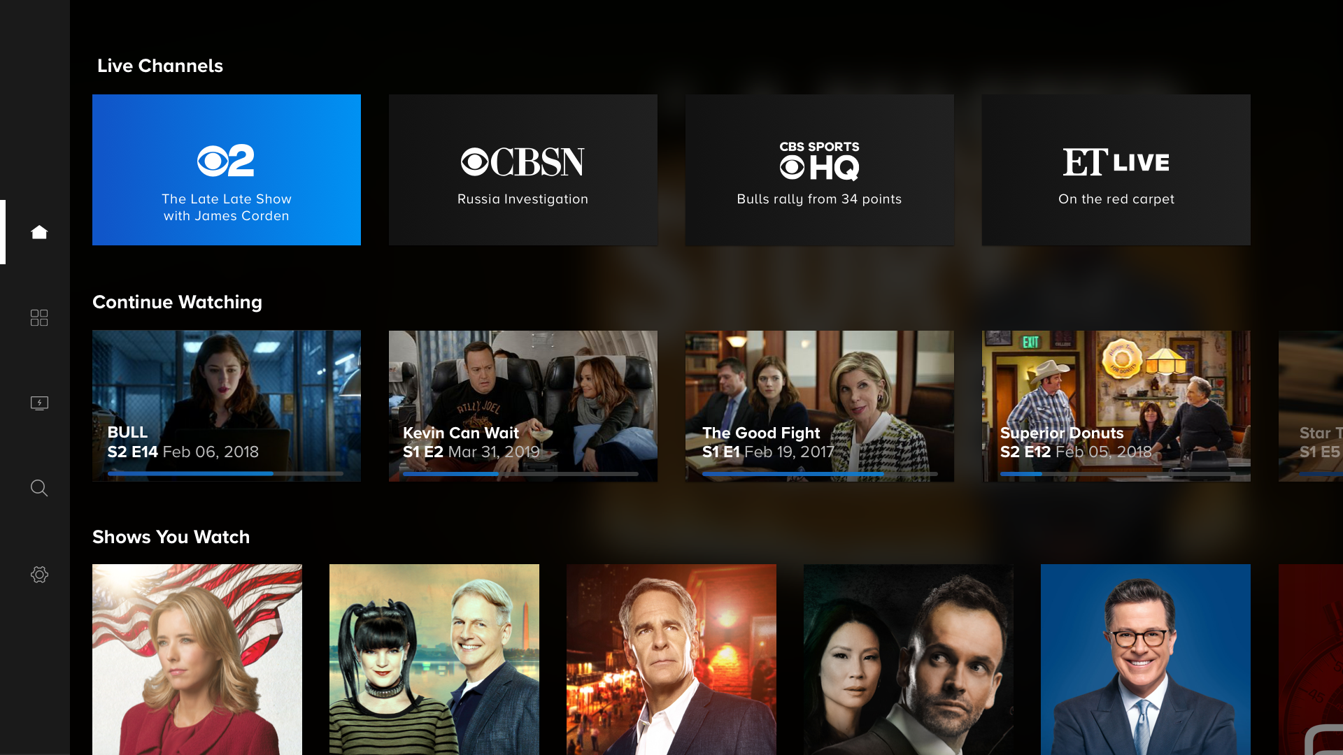
- Roadmap Initiatives: Identified and advocated for future enhancements, including a dedicated "Live TV" row within the home screen to improve quick discoverability. Integration of enhanced voice navigation and search capabilities to improve accessibility and ease of use for all users. Initiated a preliminary design exploration for a redesigned "Live TV" functionality, aligning it with the new side navigation and laying the groundwork for future additions within the live TV channels.
The Solution
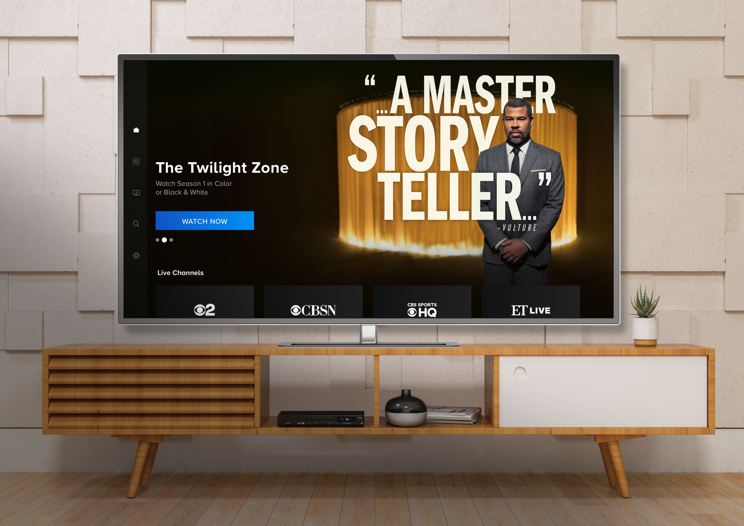
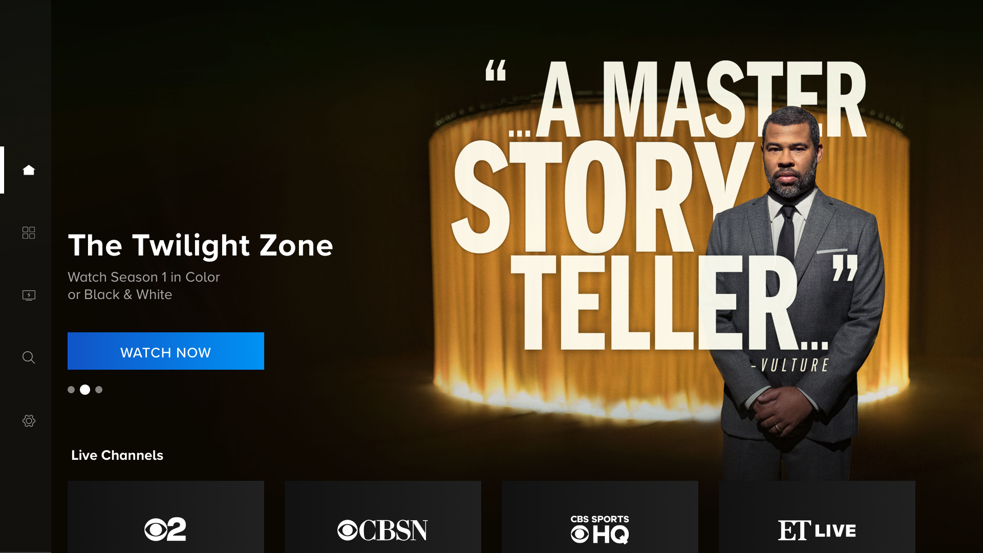
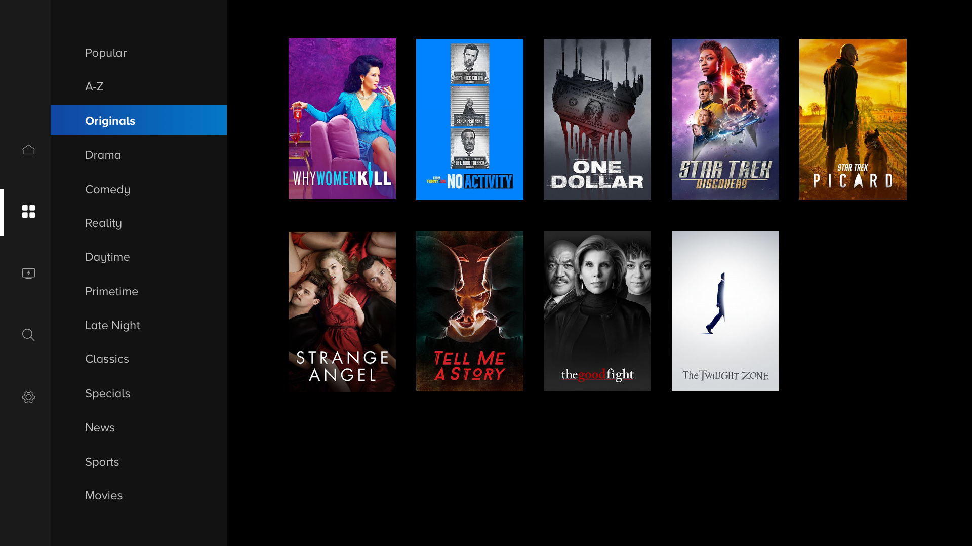
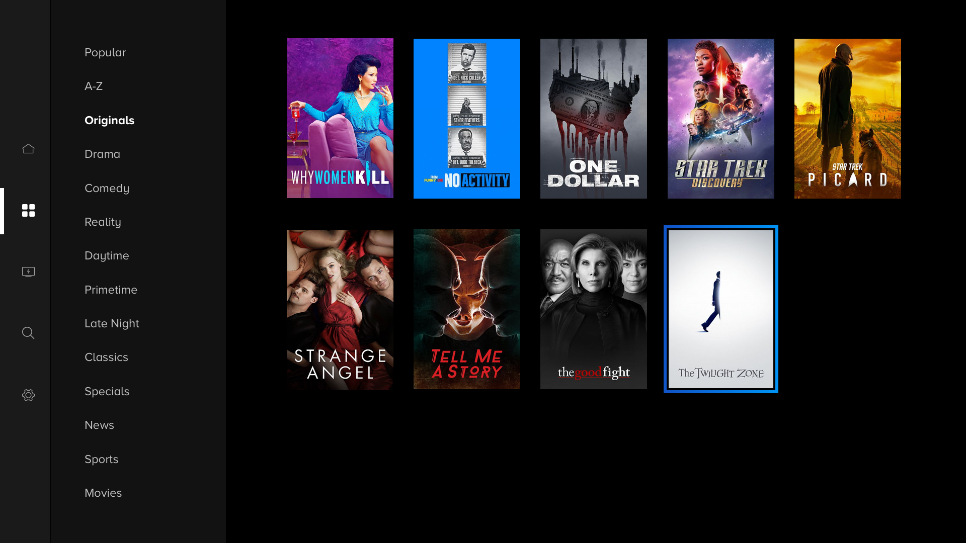
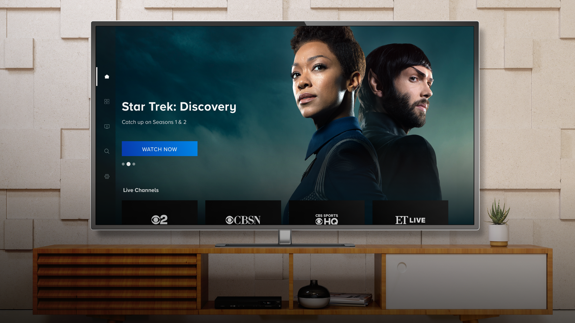
The redesigned side navigation features a clean, persistent vertical drawer-style layout with clearly organized categories and intuitive icons for a minimized view. This unified the browsing experience across devices while supporting seamless handoff between remote, touch, and voice controls. The streamlined navigation from the side menu directly into main content significantly improved content discovery. Improvements to spacing and alignment created a more consistent and clean app layout, setting the groundwork for future design updates and ensuring maintainability.
While voice integration remains a future roadmap item, the revised navigation architecture and consistent layout prepare the application for seamless integration. This design also paved the way for future enhancements, including a redesign of “Live TV" functionality and the full redesign of the brand, transitioning from CBS All Access to the newly named family of streaming products, Paramount+.
Impact
The redesigned navigation drove significant improvements in key performance indicators. Navigation success rates increased by 35%, while average session engagement rose by 28%, demonstrating a more intuitive and engaging user experience. This improvement was initially validated through A/B testing on the Xbox platform prior to broader deployment across all OTT devices. Increased percentages were compiled in collaboration with the business intelligence team utilizing the first 3 months of user click-through data once the change was pushed across all OTT devices.
Reflection
This project represented a significant milestone in my professional development, both as a design manager and as a product designer. It underscored the critical importance of cross-functional collaboration, iterative validation through rigorous A/B testing, and integrating accessibility considerations throughout the design process. Looking forward, I am eager to explore opportunities for deeper personalization within the side navigation and to expand voice design capabilities to encompass multi-language support, further enhancing the platform's inclusivity and user experience.
EMPATHISE
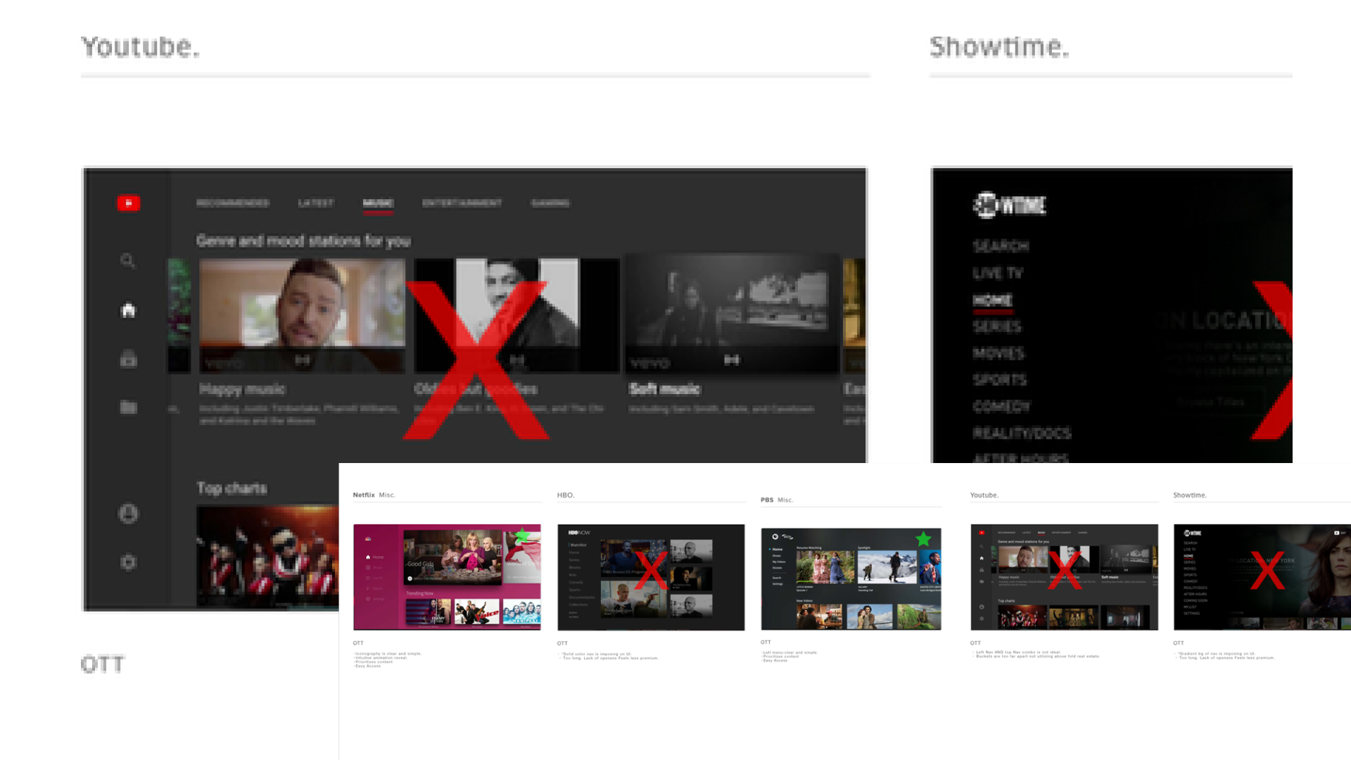
Competitive analysis showed that hybrid navigation patterns often led to usability challenges. Top and side navigation approaches consistently offered a more intuitive user experience.
DEFINE
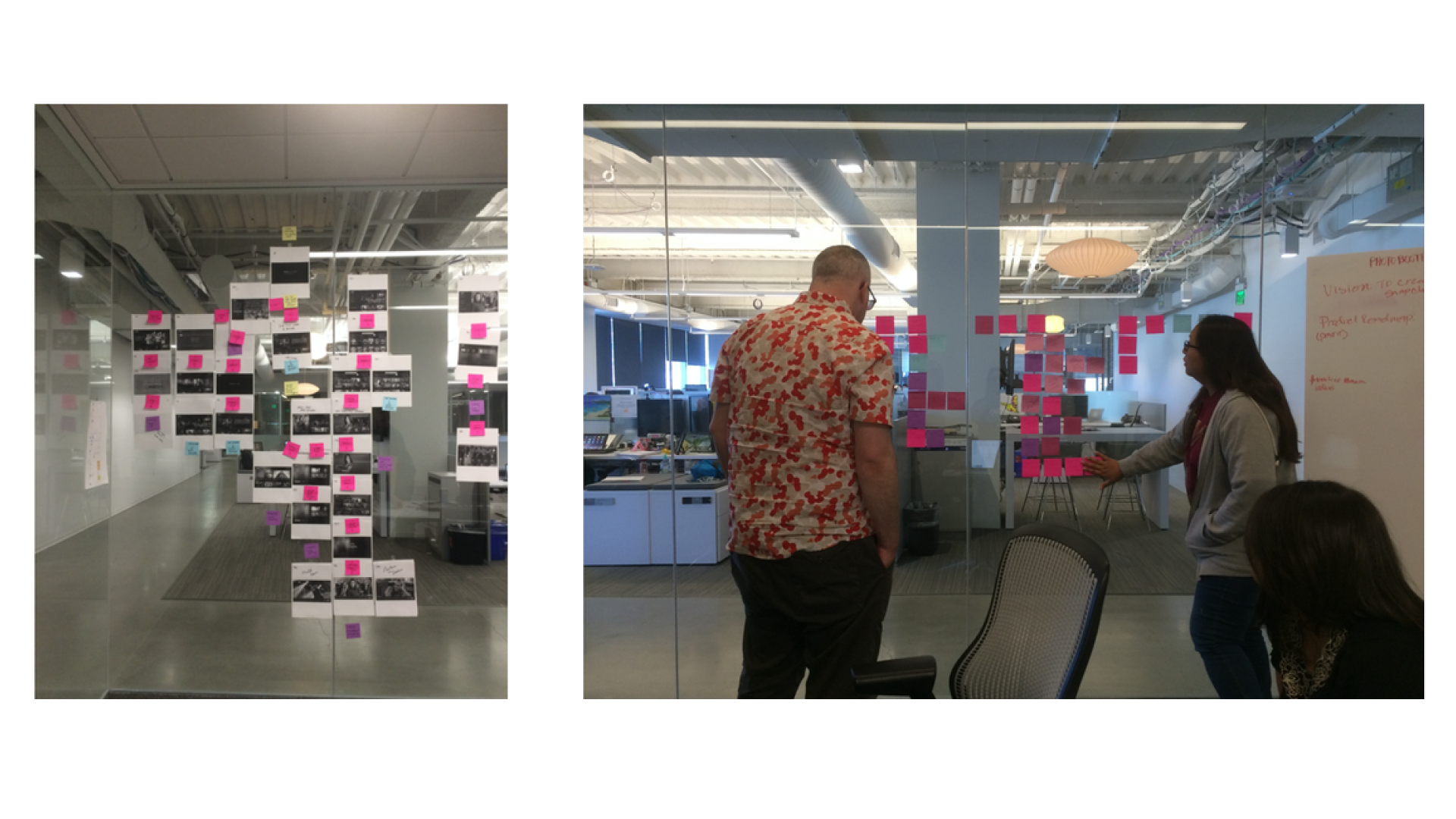
We defined the problem space through an app audit and affinity mapping, which enabled us to identify key user needs and inform the development of initial problem statements for early user testing.
IDEATE
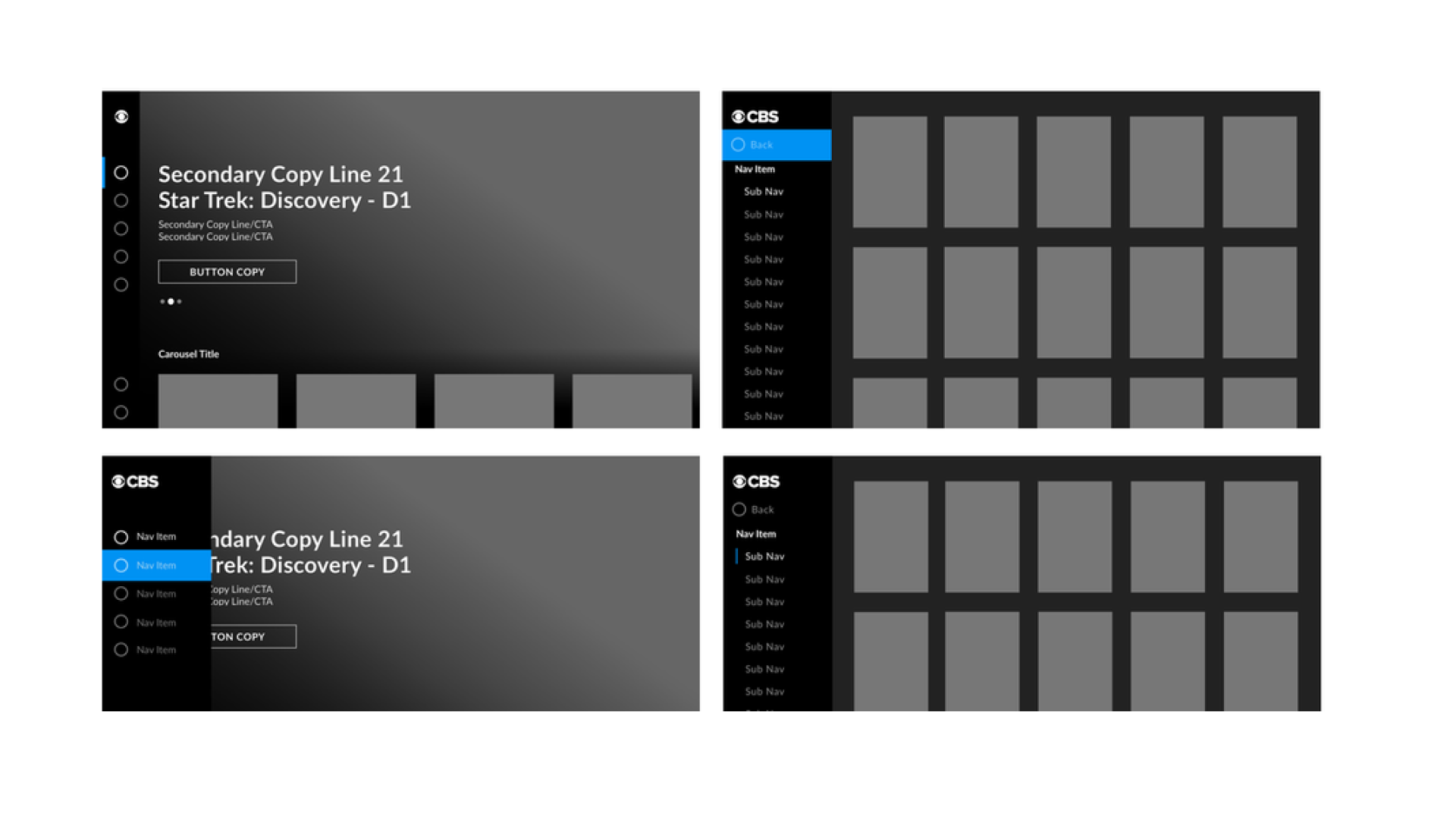
To explore potential solutions, we rapidly prototyped wireframes for key areas of the app, focusing on how the side navigation changes would impact user flow and functionality.